Xamarin.Forms Views
Button
The Button is probably the most common control not only in mobile applications, but in any applications that have a UI. The concept of a button has too many purposes to list here. Generally speaking though, you will use a button to allow users to initiate some sort of action or operation within your application. This operation could include anything from basic navigation within your app, to submitting data to a web service somewhere on the Internet.
XAML
<Button
    x:Name="MyButton"
    Text="Click Me!"
    TextColor="Red"
    BorderColor="Blue"
    VerticalOptions="Center"
    HorizontalOptions="Center"
    Clicked="Button_Clicked"/>
XAML Code-Behind
public void Button_Clicked( object sender, EventArgs args )
{
    MyButton.Text = "I've been clicked!";
}
Code
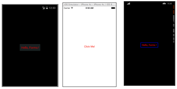
var button = new Button( )
{
    Text = "Hello, Forms !",
    VerticalOptions = LayoutOptions.CenterAndExpand,
    HorizontalOptions = LayoutOptions.CenterAndExpand,
    TextColor = Color.Red,
    BorderColor = Color.Blue,
};

button.Clicked += ( sender, args ) =>
{
    var b = (Button) sender;
    b.Text = "I've been clicked!";
};
DatePicker
Quite often within mobile applications, there will be a reason to deal with dates. When working with dates, you will probably need some sort of user input to select a date. This could occur when working with a scheduling or calendar app. In this case, it is best to provide users with a specialized control that allows them to interactively pick a date, rather than requiring users to manually type a date. This is where the DatePicker control is really useful.
XAML
<DatePicker Date="09/12/2014" Format="d" />Code
var datePicker = new DatePicker{
Date = DateTime.Now,
Format = "d"
};
Entry
The Entry View is used to allow users to type a single line of text. This single line of text can be used for multiple purposes including entering basic notes, credentials, URLs, and more. This View is a multi-purpose View, meaning that if you need to type regular text or want to obscure a password, it is all done through this single control.
XAML
<Entry Placeholder="Please Enter Some Text Here"
HorizontalOptions="Center"
VerticalOptions="Center"
Keyboard="Email"/>
Code
var entry = new Entry {
Placeholder = "Please Enter Some Text Here",
HorizontalOptions = LayoutOptions.Center,
VerticalOptions = LayoutOptions.Center,
Keyboard = Keyboard.Email
};
Editor
The Editor is very similar to the Entry in that it allows users to enter some free-form text. The difference is that the Editor allows for multi-line input whereas the Entry is only used for single line input. The Entry also provides a few more properties than the Editor to allow further customization of the View.
XAML
<Editor HorizontalOptions="Fill"
VerticalOptions="Fill"
 Keyboard="Chat"/>
Code
var editor = new Editor {
HorizontalOptions = LayoutOptions.Fill,
VerticalOptions = LayoutOptions.Fill,
Keyboard = Keyboard.Chat
};
Image
Images are very important parts of any application. They provide the opportunity to inject additional visual elements as well as branding into your application. Not to mention that images are typically more interesting to look at than text or buttons. You can use an Image as a standalone element within your application, but an Image element can also be added to other View elements such as a Button.
XAML
<Image Aspect="AspectFit" Source="https://d2g29cya9iq7ip.cloudfront.net/co
ntent/images/company/aboutus-video-bg.png?v=25072014072745"/>
Code
var image = new Image {
Aspect = Aspect.AspectFit,
Source = ImageSource.FromUri(new Uri("https://d2g29cya9iq7ip.cloudfron
t.net/content/images/company/aboutus-video-bg.png?v=25072014072745"))
};
Label
Believe it or not, the Label is one of the most crucial yet underappreciated View classes not only in Xamarin.Forms, but in UI development in general. It is seen as a rather boring line of text, but without that line of text it would be very difficult to convey certain ideas to the user. Label controls can be used to describe what the user should enter into an Editor or Entry control. They can describe a section of the UI and give it context. They can be used to show the total in a calculator app. Yes, the Label is truly the most versatile control in your tool bag that may not always spark a lot of attention, but it is the first one noticed if it isn’t there.
XAML
<Label Text="This is some really awesome text in a Label!"
TextColor="Red"
XAlign="Center"
YAlign="Center"/>
Code
var label = new Label {
Text = "This is some really awesome text in a Label!",
TextColor = Color.Red,
XAlign = TextAlignment.Center,
YAlign = TextAlignment.Center
};