Buttons in twitter-bootstrap-3
Using twitter-bootstrap btn class
btn class of Twitter-bootstrap can be used with any of the following html elements.
- anchor
- button
- input
with both type="button" and type="submit"
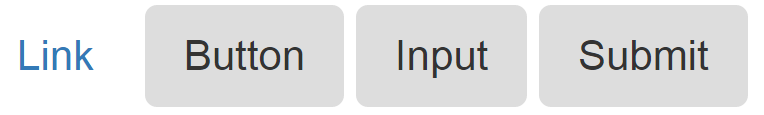
Below are examples of all possible use cases of btn class
<a class="btn" href="#" role="button">Link</a>
<button class="btn" type="submit">Button</button>
<input class="btn" type="button" value="Input">
<input class="btn" type="submit" value="Submit">
Although btn class can used in any of the above four ways but it is highly recommend using the <button> element whenever possible
Image of the above code is attached below
different sizes of button in twitter-bootstrap-3
twitter-bootstrap-3 has provided four different sizes of buttons
-
Large button
btn-lg -
Default button
does not require any btn size -
Small button
btn-sm -
Extra small button
btn-xs
Image of the above code is attached below
Add Glyphicon to Button
Glyphicons can be used in text, buttons, toolbars, navigation, forms, etc (Source: W3Schools). Glyphicons are basically icon forms that can be used to style any of the aforementioned. These examples outline the usage of glyphicons inside two types of buttons by simply using a span inside the buttons which have a class of type glyphicon:
HTML Button
<button type="button" class="btn btn-info">
    <span class="glyphicon glyphicon-search"></span> Search
</button>
ASP Button
<asp:LinkButton runat="server" CssClass="btn btn-info" >
    <span class="glyphicon glyphicon-envelope"></span> Email
</asp:LinkButton>