Grid System
Bootstrap Grid System
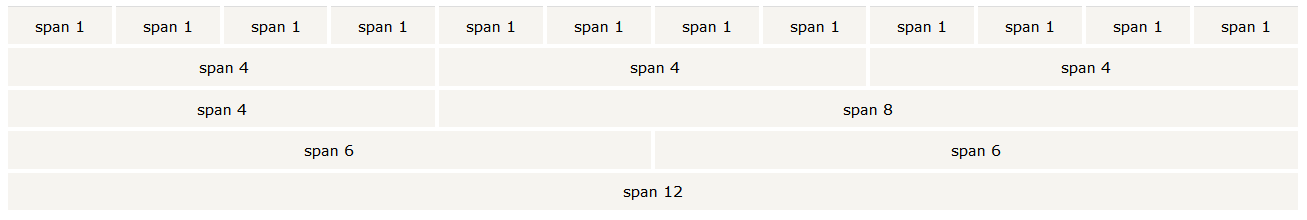
Bootstrap uses a Grid System having rows and columns
In the Grid system, you are using a row class to create a horizontal box with a total of 12 columns of size 1 unit each for different screen size vertically. If you do not want to use all 12 columns individually, you can group the columns together to create wider columns.
Example : if you want to make a row of 3 columns - you have a div with class=“row” (i.e one horizontal box) and 3 columns( class = col.xs.xx) each of size 3, size 2, size 7 ( 3+2+7 =12) for xs = extra small screen size of size
title
lorem ipsum
Grid Classes
The Bootstrap grid system has four classes for responsive design like this:
xs (for phones)
sm (for tablets)
md (for desktops)
lg (for larger desktops)
How to use?
For basic example 4 columns
<div class="row">
  <div class="col-sm-4">Your Div Content</div>
  <div class="col-sm-4">Your Div Content</div>
  <div class="col-sm-4">Your Div Content</div>
</div>
Example 4 columns
