Using Clearfix in Rows and Cols
Introduction#
When creating advanced layouts, there may be scenarios when you’ll need to use more than 12 column units in a single .row element. The concept of column wrapping and responsive resets (A.K.A. clearfixes) are essential to understanding responsive design with Bootstrap.
Remarks#
Bootstraps grids are remarkably powerful and elegant. However, you must remember that the name of the framework is “Bootstrap”, not “WeDidItForYou”. Bootstrap enables responsive design, it does not guarantee it.
It is still up to you to make your design truly responsive, and give your users the best possible end-user experience.
The Naive First Attempt
Before we begin, let’s define some CSS for the examples. This is the head section of our sample. I always use border-radius and background-color when I’m testing, because it makes seeing cell divisions simple without adding any border size which could affect the size of the cells.
<head>
    <title></title>
    <link rel="stylesheet" href="//maxcdn.bootstrapcdn.com/bootstrap/3.3.7/css/bootstrap.min.css">
    <style>
        /* colorize all col- */
        [class^="col-"] {
            min-height: 30px;
            border-radius: 10px;
            background-color: lightblue;
        }
        /* a tall cell */
        .cell-tall {
            height: 100px;
            background-color: orange;
        }
        /* a medium-height cell */
        .cell-med {
            height: 50px;
            background-color: lightgreen;
        }
        /* padding top-bottom for some row examples */
        .row.padded {
            padding: 1rem 0 1rem 0;
        }
    </style>
</head>
With that out of the way, let’s define a grid and look at the perfect results at all viewport sizes!
Using col-xs-6 col-md-3
<div class="container-fluid">
    <div class="row">
        <div class="col-xs-6 col-md-3">1</div>
        <div class="col-xs-6 col-md-3">2</div>
        <div class="col-xs-6 col-md-3">3</div>
        <div class="col-xs-6 col-md-3">4</div>
        <div class="col-xs-6 col-md-3">5</div>
        <div class="col-xs-6 col-md-3">6</div>
        <div class="col-xs-6 col-md-3">7</div>
        <div class="col-xs-6 col-md-3">8</div>
        <div class="col-xs-6 col-md-3">9</div>
        <div class="col-xs-6 col-md-3">10</div>
        <div class="col-xs-6 col-md-3">11</div>
    </div>
</div>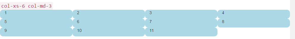
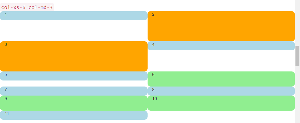
The previous two images show the rendering at medium and small screen sizes. Remember, we’ll get FOUR columns on medium+ because of col-md-3, and TWO cells at small- because of col-xs-6.
Looks pretty good, right? I think we’re done here! Said a LOT of naive Bootstrap sites out there just waiting to break…
The Height Problem
In our ”naive example”, all of our cells were the same height. The browser willingly broke the lines exactly where we wanted, and all seemed right with the world. Until height comes into the picture.
Let’s take the previous example and give some height to some of the cells, maybe like you would see on a dashoard-type page.
<div class="container-fluid">
<div class="row">
<div class="col-xs-6 col-md-3">1</div>
<div class="col-xs-6 col-md-3 cell-tall">2</div>
<div class="col-xs-6 col-md-3 cell-tall">3</div>
<div class="col-xs-6 col-md-3">4</div>
<div class="col-xs-6 col-md-3">5</div>
<div class="col-xs-6 col-md-3 cell-med">6</div>
<div class="col-xs-6 col-md-3">7</div>
<div class="col-xs-6 col-md-3">8</div>
<div class="col-xs-6 col-md-3 cell-med">9</div>
<div class="col-xs-6 col-md-3 cell-med">10</div>
<div class="col-xs-6 col-md-3">11</div>
</div>
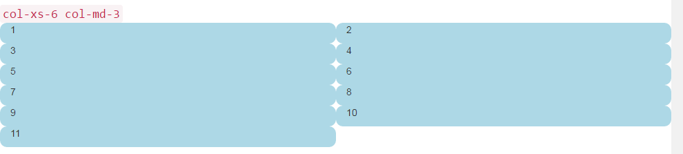
</div>Here we have added some cell-tall and cell-med CSS that we defined above. This will have the effect of changing the height of some of the cells. I wonder how it will look…
Here they are again at medium and small screen sizes:
Oh my, what a mess. I don’t think that’s what we wanted. At medium-large size, 5 and 6 are way out of place, and somehow 7 ended up starting a new row. At small size we have two cells in the first row, and four in the second row, with 4, 5, and 6 all stacked up on the right at both screen sizes!
So, how do we solve this?
Clearfix to the Rescue
One way to help the situation certainly, would be to use more than one row:
<div class="container-fluid">
    <div class="row">
        <!-- cols -->
    </div>
    <div class="row">
        <!-- cols -->
    </div>
</div>
This is usually the first thing that new Bootstrappers try. It seems to make sense: “I want four cells in each row, so I’ll just create a new row for each 4 col divs”.
But there is problem with this line of reasoning: The whole point of Bootstrap 3 and the upcoming version 4 is to be responsive. By placing “four col in a row”, you are not really “thinking responsively”.
A good understanding of the clearfix CSS class will help you begin to see that multiple row divs have really been clouding your understanding of the way that responsive design was meant to work. In short, you simply cannot know how many col to put in a row anyway - the browser hasn’t rendered your work yet!
Remember in First Things First, we said you need to think in “inverse of 12”? Without further ado, let’s fix our problem here, using comments right in the code to hopefully clear up any confusion. Yes, it looks like a lot more code, but most of the extra is comments.
<div class="container-fluid">
    <div class="row">
        <div class="col-xs-6 col-md-3">1</div>
        <div class="col-xs-6 col-md-3 cell-tall">2</div>
        <!--
            We have rendered TWO cells.
            On small and extra small devices, the viewport will render TWO cells
            (12 / 6 = 2), so we need a clearfix every TWO cells. We also need to
            say "don't show this clearfix when the viewport will render FOUR cells",
            which it will do at medium size and up (12 / 3 = 4). We do that by adding
            hidden-md and hidden-lg to our clearfix div, in effect instructing the
            browser to not show it at all on a wider screen.
        -->
        <div class="clearfix hidden-md hidden-lg"></div>
        <!---->
        <div class="col-xs-6 col-md-3 cell-tall">3</div>
        <div class="col-xs-6 col-md-3">4</div>
        <!--
            We have now rendered FOUR cells.
            We are never going to have more than FOUR cells side by side. So every
            FOURTH cell, we place a clearfix that will ALWAYS show. We do this by
            just leaving off any of the hidden-* classes.
        -->
        <div class="clearfix"></div>
        <!---->
        <div class="col-xs-6 col-md-3">5</div>
        <div class="col-xs-6 col-md-3 cell-med">6</div>
        <!--
            We have now rendered SIX cells.
            After the sixth cell, we are at a multiple of TWO, but not FOUR so we
            repeat the clearfix that we used after cell TWO.
        -->
        <div class="clearfix hidden-md hidden-lg"></div>
        <!---->
        <div class="col-xs-6 col-md-3">7</div>
        <div class="col-xs-6 col-md-3">8</div>
        <!--
            Now we have rendered EIGHT cells, which is a multiple of TWO AND FOUR,
            so we put in a clearfix that's always visible.
        -->
        <div class="clearfix"></div>
        <!---->
        <div class="col-xs-6 col-md-3 cell-med">9</div>
        <div class="col-xs-6 col-md-3 cell-med">10</div>
        <!--
            After the 10th cell, once again a multiple of TWO but not FOUR...
        -->
        <div class="clearfix hidden-md hidden-lg"></div>
        <!---->
        <div class="col-xs-6 col-md-3">11</div>
    </div>
</div>
The clearfix is a CSS class that renders a tiny (virtually invisible) div, and its purpose is to “clear” the left floats that have been used by the col divs.
The genius is really in the hidden-sm, hidden-md, etc classes. These classes are placed on the clearfix div, NOT on the col divs! This causes the clearfix div to magically appear or disappear from the rendering stream at certain viewport widths! Genius!
Bootstrap has a baffling array of hidden-* and visible-* classes in version 3, and unfortunately they are not really the “inverse” of one another. So I find it clearest and safest to just always use the hidden-* classes on the clearfixes.
This looks like it may change for the better in Bootstrap 4, with classes like hidden-*-up and hidden-*-down (they are getting rid of the visible-* classes entirely).
Well enough verbiage, what does it look like now?
That’s what we want! In the large screen, we always have FOUR across, in the smaller screen, always TWO across. No more stacking in weird places, and gaps are where we would expect them to be.
A Dashboard
Well enough of those colored rounded things, let’s put something more interesting than numbers in those divs. Let’s take that same set of columns and make a real dashboard. Use the following CSS:
<head>
    <title></title>
    <link rel="stylesheet" href="//maxcdn.bootstrapcdn.com/bootstrap/3.3.7/css/bootstrap.min.css">
    <style>
        body {
            padding-top: 15px;
        }
        .panel-tall .panel-body {
            height: 175px;
        }
        .panel-med .panel-body {
            height: 100px;
        }
        .panel-short .panel-body {
            height: 70px;
        }
    </style>
</head>
And here is the “dashboard” code:
<div class="container-fluid">
<div class="row">
<div class="col-xs-6 col-md-3">
<div class="panel panel-default panel-med">
<div class="panel-heading">
Heading 1
</div>
<div class="panel-body">
Body 1
</div>
<div class="panel-footer">
Footer 1
</div>
</div>
</div>
<div class="col-xs-6 col-md-3 cell-tall">
<div class="panel panel-danger panel-tall">
<div class="panel-heading">
Heading 2
</div>
<div class="panel-body">
Body 2. Look out, this needs some attention!
</div>
<div class="panel-footer">
Footer 2
</div>
</div>
</div>
<!--
On small and extra small devices, the viewport will render TWO cells
(12 / 6 = 2), so we need a clearfix every TWO cells. We also need to
say "don't show this clearfix when the viewport will render FOUR cells",
which it will do at medium size and up (12 / 3 = 4). We do that by adding
hidden-md and hidden-lg to our clearfix div, in effect instructing the
browser to not show it at all on a wider screen.
-->
<div class="clearfix hidden-md hidden-lg"></div>
<!---->
<div class="col-xs-6 col-md-3 cell-tall">
<div class="panel panel-success panel-short">
<div class="panel-heading">
Heading 3
</div>
<div class="panel-body">
Body 3. The file has successfully uploaded.
</div>
<div class="panel-footer">
Footer 3
</div>
</div>
</div>
<div class="col-xs-6 col-md-3">
<div class="panel panel-default panel-tall">
<div class="panel-heading">
Heading 4 Chart
</div>
<div class="panel-body">
Body 4. Is this a cool graph or what?
</div>
<div class="panel-footer">
Footer 4
</div>
</div>
</div>
<!--
We are never going to have more than FOUR cells. So every FOURTH cell,
we place a clearfix that will ALWAYS show. We do this by just leaving off
any of the hidden-* classes.
-->
<div class="clearfix"></div>
<!---->
<div class="col-xs-6 col-md-3">
<div class="panel panel-warning panel-short">
<div class="panel-heading">
Heading 5
</div>
<div class="panel-body">
Body 5.
</div>
<div class="panel-footer">
Footer 5
</div>
</div>
</div>
<div class="col-xs-6 col-md-3 cell-med">
<div class="panel panel-warning panel-tall">
<div class="panel-heading">
Heading 6
</div>
<div class="panel-body">
Body 6.
</div>
</div>
</div>
<!--
After the sixth cell, we are at a multiple of TWO, but not FOUR so we
repeat the clearfix that we used after cell TWO.
-->
<div class="clearfix hidden-md hidden-lg"></div>
<!---->
<div class="col-xs-6 col-md-3">
<div class="panel panel-info panel-tall">
<div class="panel-heading">
Heading 7
</div>
<div class="panel-body">
Body 7.
</div>
<div class="panel-footer">
Footer 7
</div>
</div>
</div>
<div class="col-xs-6 col-md-3">
<div class="panel panel-info panel-med">
<div class="panel-heading">
Heading 8
</div>
<div class="panel-body">
Body 8.
</div>
<div class="panel-footer">
Footer 8
</div>
</div>
</div>
<!--
Now we have rendered EIGHT cells, which is a multiple of TWO AND FOUR,
so we put in a clearfix that's always visible.
-->
<div class="clearfix"></div>
<!---->
<div class="col-xs-6 col-md-3 cell-med">
<div class="panel panel-info panel-short">
<div class="panel-heading">
Heading 9
</div>
<div class="panel-body">
Body 9.
</div>
<div class="panel-footer">
Footer 9
</div>
</div>
</div>
<div class="col-xs-6 col-md-3 cell-med">
<div class="panel panel-info panel-tall">
<div class="panel-heading">
Heading 10
</div>
<div class="panel-body">
Body 10.
</div>
<div class="panel-footer">
Footer 10
</div>
</div>
</div>
<!--
After the 10th cell, once again a multiple of TWO but not FOUR...
-->
<div class="clearfix hidden-md hidden-lg"></div>
<!---->
<div class="col-xs-6 col-md-3">
<div class="panel panel-info panel-tall">
<div class="panel-heading">
Heading 11
</div>
<div class="panel-body">
Body 11.
</div>
<div class="panel-footer">
Footer 11
</div>
</div>
</div>
</div>
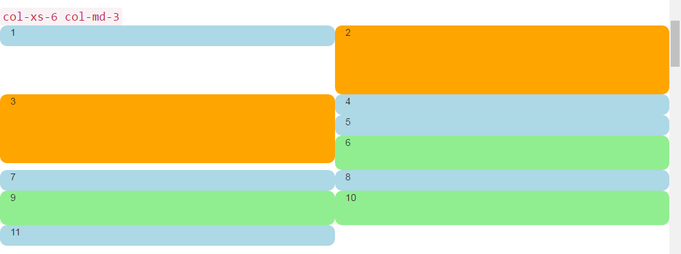
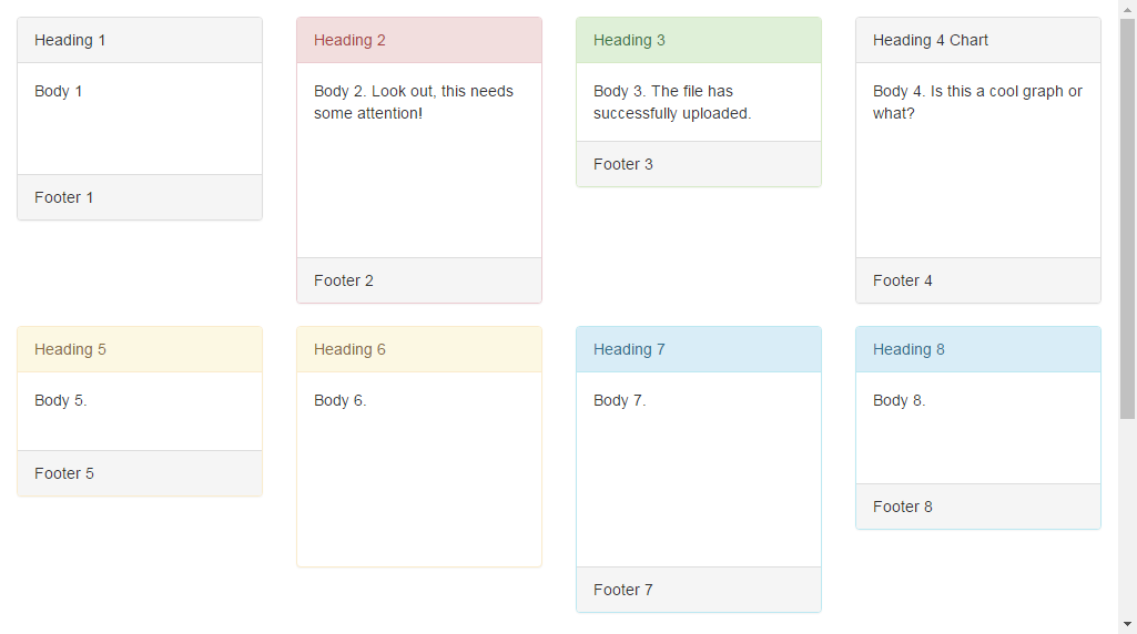
</div>That code will look like this:
 And like this in smaller viewports:
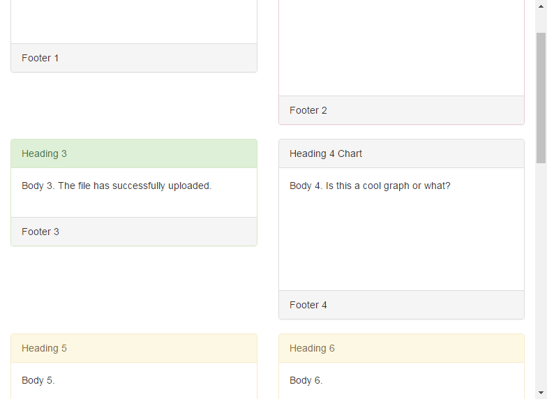
By the way I’m using the Bootstrap 3 panel class, which will go away in Bootstrap 4 and be replaced by the much more descriptive and specific card. Looking at these images, you can see why card will be a much better name than the ambiguous panel.
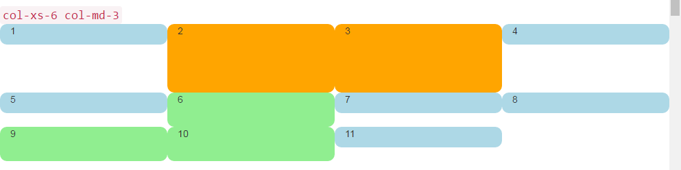
2,4,6 Layout with Clearfixes
Here’s a layout that renders two, four, or six cells across depending on screen size.
<div class="container-fluid">
    <div class="row">
        <div class="col-xs-6 col-md-3 col-lg-2">1</div>
        <div class="col-xs-6 col-md-3 col-lg-2 cell-tall">2</div>
        <!--
            On small and extra small devices, the viewport will render TWO cells
            (12 / 6 = 2), so we need a clearfix every TWO cells. We also need to
            say "don't show this clearfix when the viewport will render FOUR cells",
            which it will do at medium size (12 / 3 = 4). We do that by adding
            hidden-md and hidden-lg to our clearfix div, in effect instructing the
            browser to not show it at all on a wider screen.
        -->
        <div class="clearfix hidden-md hidden-lg"></div>
        <!---->
        <div class="col-xs-6 col-md-3 col-lg-2 cell-tall">3</div>
        <div class="col-xs-6 col-md-3 col-lg-2">4</div>
        <!--
            After the FOURTH cell, we need a clearfix, but it still needs to be
            hidden on LARGE viewports, because remember we will have a maximum of
            SIX cells now.
        -->
        <div class="clearfix hidden-lg"></div>
        <!---->
        <div class="col-xs-6 col-md-3 col-lg-2">5</div>
        <div class="col-xs-6 col-md-3 col-lg-2 cell-med">6</div>
        <!--
            After the SIXTH cell, we need to show on SMALL and LARGE, but not on
            MEDIUM. Remember, our MEDIUM viewport only wants a clearfix when we
            are at a multiple of FOUR.
        -->
        <div class="clearfix hidden-md"></div>
        <!---->
        <div class="col-xs-6 col-md-3 col-lg-2">7</div>
        <div class="col-xs-6 col-md-3 col-lg-2">8</div>
        <!--
            Now we have rendered EIGHT cells, which is a multiple of TWO AND FOUR,
            so we put in a clearfix that's not visible on LARGE, because we are NOT
            at a multiple of SIX.
        -->
        <div class="clearfix hidden-lg"></div>
        <!---->
        <div class="col-xs-6 col-md-3 col-lg-2 cell-med">9</div>
        <div class="col-xs-6 col-md-3 col-lg-2 cell-med">10</div>
        <!--
            After the 10th cell, small only.
        -->
        <div class="clearfix hidden-md hidden-lg"></div>
        <!---->
        <div class="col-xs-6 col-md-3 col-lg-2">11</div>
    </div>
</div>
Large Screen:
Medium Screen:
Small Screen:
Why Would Bootstrap Columns Exceed 12 in a Row?
There are many responsive scenarios where it’s necessary to have column units exceeding 12 in a single .row element. This is known as column wrapping.
If more than 12 columns are placed within a single row, each group of extra columns will, as one unit, wrap onto a new line.
For example, consider a layout where we want…
- 3 columns across on large & medium devices, and
- 2 columns across on small & smallest devices
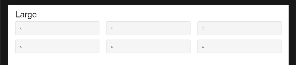
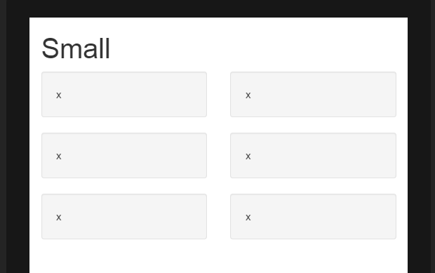
To get this layout in Bootstrap, we’d use (correct)..
<div class="row">
  <div class="col-xs-6 col-md-4"> x </div>
  <div class="col-xs-6 col-md-4"> x </div>
  <div class="col-xs-6 col-md-4"> x </div>
  <div class="col-xs-6 col-md-4"> x </div>
  <div class="col-xs-6 col-md-4"> x </div>
  <div class="col-xs-6 col-md-4"> x </div>
</div>As you see in the example, the total of column units in the .row element exceeds 12. This technique is known as column wrapping and it’s one of Bootstrap’s most powerful responsive design features. The desired layout would not be possible (other than duplicating markup) if we tried to stick with the common misconception that column units must add up to 12 in a single row.
The layout is not possible when we don’t exceed 12 (wrong)..
<div class="row">
  <div class="col-xs-6 col-md-4"> x </div>
  <div class="col-xs-6 col-md-4"> x </div>
</div>
<div class="row">
  <div class="col-xs-6 col-md-4"> x </div>
  <div class="col-xs-6 col-md-4"> x </div>
</div>
<div class="row">
  <div class="col-xs-6 col-md-4"> x </div>
  <div class="col-xs-6 col-md-4"> x </div>
</div>
Wrong method demo (fails 3 columns across on large)
Remember, a .row is not the same as a single line across the viewport. A .row is a grouping of columns. The columns exceeding 12 units in a single .row element will wrap to a new line (down the viewport). That’s why is essential to understand that the 12 columns represent horizontal units across the viewport.
Additionally, responsive resets (clearfix) must be used for even wrapping when columns vary in height.