Grid Nesting
Introduction#
In Bootstrap it’s possible to use grid columns inside other columns. This is helpful when creating advanced responsive layouts that utilize multiple grid tiers.
Remarks#
We can have as many number of columns as possible in the above mentioned way.
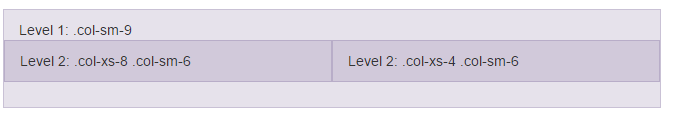
Nesting columns
<div class="row">
  <div class="col-sm-9">
    Level 1: .col-sm-9
    <div class="row">
      <div class="col-xs-8 col-sm-6">
        Level 2: .col-xs-8 .col-sm-6
      </div>
      <div class="col-xs-4 col-sm-6">
        Level 2: .col-xs-4 .col-sm-6
      </div>
    </div>
  </div>
</div>
The example is taken from https://getbootstrap.com/css/#grid-nesting
as the documentation of official website suggests
To nest your content with the default grid, add a new .row and set of .col-sm-* columns within an existing .col-sm-* column. Nested rows should include a set of columns that add up to 12 or fewer (it is not required that you use all 12 available columns).