Single Element Shapes
Square
To create a square, define an element with both a width and height. In the example below, we have an element with a width and height of 100 pixels each.
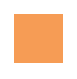
<div class="square"></div>.square {
width: 100px;
height: 100px;
background: rgb(246, 156, 85);
}Triangles
To create a CSS triangle define an element with a width and height of 0 pixels. The triangle shape will be formed using border properties. For an element with 0 height and width the 4 borders (top, right, bottom, left) each form a triangle. Here’s an element with 0 height/width and 4 different colored borders.
By setting some borders to transparent, and others to a color we can create various triangles. For example, in the Up triangle, we set the bottom border to the desired color, then set the left and right borders to transparent. Here’s an image with the left and right borders shaded slightly to show how the triangle is being formed.

The dimensions of the triangle can be altered by changing the different border widths - taller, shorter, lopsided, etc. The examples below all show a 50x50 pixel triangle.
Triangle - Pointing Up
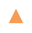
<div class="triangle-up"></div>.triangle-up {
width: 0;
height: 0;
border-left: 25px solid transparent;
border-right: 25px solid transparent;
border-bottom: 50px solid rgb(246, 156, 85);
}Triangle - Pointing Down

<div class="triangle-down"></div>.triangle-down {
width: 0;
height: 0;
border-left: 25px solid transparent;
border-right: 25px solid transparent;
border-top: 50px solid rgb(246, 156, 85);
}Triangle - Pointing Right

<div class="triangle-right"></div>.triangle-right {
width: 0;
height: 0;
border-top: 25px solid transparent;
border-bottom: 25px solid transparent;
border-left: 50px solid rgb(246, 156, 85);
}Triangle - Pointing Left

<div class="triangle-left"></div>.triangle-left {
width: 0;
height: 0;
border-top: 25px solid transparent;
border-bottom: 25px solid transparent;
border-right: 50px solid rgb(246, 156, 85);
}Triangle - Pointing Up/Right

<div class="triangle-up-right"></div>.triangle-up-right {
width: 0;
height: 0;
border-top: 50px solid rgb(246, 156, 85);
border-left: 50px solid transparent;
}Triangle - Pointing Up/Left

<div class="triangle-up-left"></div>.triangle-up-left {
width: 0;
height: 0;
border-top: 50px solid rgb(246, 156, 85);
border-right: 50px solid transparent;
}Triangle - Pointing Down/Right

<div class="triangle-down-right"></div>.triangle-down-right {
width: 0;
height: 0;
border-bottom: 50px solid rgb(246, 156, 85);
border-left: 50px solid transparent;
}Triangle - Pointing Down/Left

<div class="triangle-down-left"></div>.triangle-down-left {
width: 0;
height: 0;
border-bottom: 50px solid rgb(246, 156, 85);
border-right: 50px solid transparent;
}Bursts
A burst is similar to a star but with the points extending less distance from the body. Think of a burst shape as a square with additional, slightly rotated, squares layered on top.
The additional squares are created using the ::before and ::after psuedo-elements.
8 Point Burst
An 8 point burst are 2 layered squares. The bottom square is the element itself, the additional square is created using the :before pseudo-element. The bottom is rotated 20°, the top square is rotated 135°.
<div class="burst-8"></div>

.burst-8 {
  background: rgb(246, 156, 85);
  width: 40px;
  height: 40px;
  position: relative;
  text-align: center;
  -ms-transform: rotate(20deg);
  transform: rotate(20eg);
}

.burst-8::before {
  content: "";
  position: absolute;
  top: 0;
  left: 0;
  height: 40px;
  width: 40px;
  background: rgb(246, 156, 85);
  -ms-transform: rotate(135deg);
  transform: rotate(135deg);
}
12 Point Burst
An 12 point burst are 3 layered squares. The bottom square is the element itself, the additional squares are created using the :before and :after pseudo-elements. The bottom is rotated 0°, the next square is rotated 30°, and the top is rotated 60°.
<div class="burst-12"></div>

.burst-12 {
  width: 40px;
  height: 40px;
  position: relative;
  text-align: center;
  background: rgb(246, 156, 85);
}

.burst-12::before, .burst-12::after {
  content: "";
  position: absolute;
  top: 0;
  left: 0;
  height: 40px;
  width: 40px;
  background: rgb(246, 156, 85);
}

.burst-12::before {
  -ms-transform: rotate(30deg);
  transform: rotate(30deg);
}

.burst-12::after {
  -ms-transform: rotate(60deg);
  transform: rotate(60deg);
}
Circles and Ellipses
Circle
To create a circle, define an element with an equal width and height (a square) and then set the border-radius property of this element to 50%.
HTML
<div class="circle"></div>CSS
.circle {
   width: 50px;
   height: 50px;
   background: rgb(246, 156, 85);
   border-radius: 50%;
}
Ellipse
An ellipse is similar to a circle, but with different values for width and height.
HTML
<div class="oval"></div>CSS
.oval {
  width: 50px;
  height: 80px;
  background: rgb(246, 156, 85);
  border-radius: 50%;
}
Trapezoid
A trapezoid can be made by a block element with zero height (height of 0px), a width greater than zero and a border, that is transparent except for one side:
HTML:
<div class="trapezoid"></div>CSS:
.trapezoid {
    width: 50px;
    height: 0;
    border-left: 50px solid transparent;
    border-right: 50px solid transparent;
    border-bottom: 100px solid black;
}
With changing the border sides, the orientation of the trapezoid can be adjusted.
Cube
This example shows how to create a cube using 2D transformation methods skewX() and skewY() on pseudo elements.
HTML:
<div class="cube"></div>CSS:
.cube {
  background: #dc2e2e;
  width: 100px;
  height: 100px;
  position: relative;
  margin: 50px;
}

.cube::before {
  content: '';
  display: inline-block;
  background: #f15757;
  width: 100px;
  height: 20px;
  transform: skewX(-40deg);
  position: absolute;
  top: -20px;
  left: 8px;
}

.cube::after {
  content: '';
  display: inline-block;
  background: #9e1515;
  width: 16px;
  height: 100px;
  transform: skewY(-50deg);
  position: absolute;
  top: -10px;
  left: 100%;
}Pyramid
This example shows how to create a pyramid using borders and 2D transformation methods skewY() and rotate() on pseudo elements.
HTML:
<div class="pyramid"></div>CSS:
.pyramid {
  width: 100px;
  height: 200px;
  position: relative;
  margin: 50px;
}

.pyramid::before,.pyramid::after {
  content: '';
  display: inline-block;
  width: 0;
  height: 0;
  border: 50px solid;
  position: absolute;
}

.pyramid::before {
  border-color: transparent transparent #ff5656 transparent;
  transform: scaleY(2) skewY(-40deg) rotate(45deg);
}

.pyramid::after {
  border-color: transparent transparent #d64444 transparent;
  transform: scaleY(2) skewY(40deg) rotate(-45deg);
}