Layouts
StackPane
StackPane lays out its children in a back-to-front stack.
The z-order of the children is defined by the order of the children list (accessible by calling getChildren): the 0th child being the bottom and last child on top of the stack.
The stackpane attempts to resize each child to fill its own content area. In the case if a child cannot be resized to fill the area of the StackPane (either because it was not resizable or its max size prevented it) then it will be aligned within the area using the alignmentProperty of the stackpane, which defaults to Pos.CENTER.
Example
// Create a StackPane
StackPane pane = new StackPane();

// Create three squares
Rectangle rectBottom = new Rectangle(250, 250);
rectBottom.setFill(Color.AQUA);
Rectangle rectMiddle = new Rectangle(200, 200);
rectMiddle.setFill(Color.CADETBLUE);
Rectangle rectUpper = new Rectangle(150, 150);
rectUpper.setFill(Color.CORAL);

// Place them on top of each other
pane.getChildren().addAll(rectBottom, rectMiddle, rectUpper);
HBox and VBox
The HBox and VBox layouts are very similar, both lay out their children in a single line.
Common characteristics
If an HBox or a VBox have a border and/or padding set, then the contents will be layed out within those insets.
They lay out each managed child regardless of the child’s visible property value; unmanaged children are ignored.
The alignment of the content is controlled by the alignment property, which defaults to Pos.TOP_LEFT.
HBox
HBox lays out its children in a single horizontal row from left to right.
HBox will resize children (if resizable) to their preferred widths and uses its fillHeight property to determine whether to resize their heights to fill its own height or keep their heights to their preferred (fillHeight defaults to true).
Creating a HBox
// HBox example
HBox row = new HBox();
Label first = new Label("First");
Label second = new Label("Second");
row.getChildren().addAll(first, second);
VBox
VBox lays out its children in a single vertical column from top to bottom.
VBox will resize children (if resizable) to their preferred heights and uses its fillWidth property to determine whether to resize their widths to fill its own width or keep their widths to their preferred (fillWidth defaults to true).
Creating a VBox
// VBox example
VBox column = new VBox();
Label upper = new Label("Upper");
Label lower = new Label("Lower");
column.getChildren().addAll(upper, lower);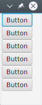
BorderPane
The BorderPane is separated into five different areas.
The border areas (Top, Right, Bottom, Left) have preferred sized based on their content. By default they will only take what they need, while the Center area will take any remaining space. When the border areas are empty, they do not take up any space.
Each area can contain only one element. It can be added using the methods setTop(Node), setRight(Node), setBottom(Node), setLeft(Node), setCenter(Node). You can use other layouts to put more than one element into a single area.
//BorderPane example
BorderPane pane = new BorderPane();

Label top = new Label("Top");

Label right = new Label("Right");

HBox bottom = new HBox();
bottom.getChildren().addAll(new Label("First"), new Label("Second"));

VBox left = new VBox();
left.getChildren().addAll(new Label("Upper"), new Label("Lower"));

StackPane center = new StackPane();
center.getChildren().addAll(new Label("Lorem"), new Label("ipsum"));

pane.setTop(top);        //The text "Top"
pane.setRight(right);    //The text "Right"
pane.setBottom(bottom);  //Row of two texts
pane.setLeft(left);      //Column of two texts
pane.setCenter(center);  //Two texts on each other
FlowPane
FlowPane lays out nodes in rows or columns based on the available horizontal or vertical space available. It wraps nodes to the next line when the horizontal space is less than the total of all the nodes’ widths; it wraps nodes to the next column when the vertical space is less than the total of all the nodes’ heights. This example illustrates the default horizontal layout:
import javafx.application.Application;
import javafx.fxml.FXMLLoader;
import javafx.scene.Parent;
import javafx.scene.Scene;
import javafx.scene.control.Button;
import javafx.scene.layout.FlowPane;
import javafx.stage.Stage;

public class Main extends Application {
    @Override
    public void start(Stage primaryStage) throws Exception{
        FlowPane root = new FlowPane();
        for (int i=1; i<=15; i++) {
            Button b1=new Button("Button "+String.valueOf(i));
            root.getChildren().add(b1); //for adding button to root
        }
        Scene scene = new Scene(root, 300, 250);
        primaryStage.setTitle("FlowPane Layout");
        primaryStage.setScene(scene);
        primaryStage.show();
    }
    public static void main(String[] args) {
        launch(args);
    }
}
Default
FlowPaneconstructor:
FlowPane root = new FlowPane();Additional
FlowPaneconstructors:
FlowPane() //Creates a horizontal FlowPane layout with hgap/vgap = 0 by default.
FlowPane(double hgap, double gap) //Creates a horizontal FlowPane layout with the specified hgap/vgap.
FlowPane(double hgap, double vgap, Node... children) //Creates a horizontal FlowPane layout with the specified hgap/vgap.
FlowPane(Node... children) //Creates a horizontal FlowPane layout with hgap/vgap = 0.
FlowPane(Orientation orientation) //Creates a FlowPane layout with the specified orientation and hgap/vgap = 0.
FlowPane(Orientation orientation, double hgap, double gap) //Creates a FlowPane layout with the specified orientation and hgap/vgap.
FlowPane(Orientation orientation, double hgap, double vgap, Node... children) //Creates a FlowPane layout with the specified orientation and hgap/vgap.
FlowPane(Orientation orientation, Node... children) //Creates a FlowPane layout with the specified orientation and hgap/vgap = 0.
Adding nodes to the layout uses the
add()oraddAll()methods of the parentPane:
Button btn = new Button("Demo Button");
root.getChildren().add(btn);
root.getChildren().addAll(…);
By default, a FlowPane lays out child nodes from left to right. To change the flow alignment, call the setAlignment() method by passing in an enumerated value of type Pos.
Some commonly used flow alignments:
root.setAlignment(Pos.TOP_RIGHT);     //for top right
root.setAlignment(Pos.TOP_CENTER);    //for top Center
root.setAlignment(Pos.CENTER);        //for Center
root.setAlignment(Pos.BOTTOM_RIGHT);  //for bottom right
GridPane
GridPane lays out its children within a flexible grid of rows and columns.
Children of the GridPane
A child may be placed anywhere within the GridPane and may span multiple rows/columns (default span is 1) and its placement within the grid is defined by it’s layout constraints:
| Constraint | Description |
|---|---|
| columnIndex | column where child’s layout area starts. |
| rowIndex | row where child’s layout area starts. |
| columnSpan | the number of columns the child’s layout area spans horizontally. |
| rowSpan | the number of rows the child’s layout area spans vertically. |
The total number of rows/columns does not need to be specified up front as the gridpane will automatically expand/contract the grid to accommodate the content.
Adding children to the GridPane
In order to add new Nodes to a GridPane the layout constraints on the children should be set using the static method of GridPane class, then those children can be added to a GridPane instance.
GridPane gridPane = new GridPane();

// Set the constraints: first row and first column
Label label = new Label("Example");
GridPane.setRowIndex(label, 0);
GridPane.setColumnIndex(label, 0);
// Add the child to the grid
gridpane.getChildren().add(label);
GridPane provides convenient methods to combine these steps:
gridPane.add(new Button("Press me!"), 1, 0); // column=1 row=0The GridPane class also provides static setter methods to set the row- and columnspan of child elements:
Label labelLong = new Label("Its a long text that should span several rows");
GridPane.setColumnSpan(labelLong, 2);
gridPane.add(labelLong, 0, 1);  // column=0 row=1
Size of Columns and Rows
By default, rows and columns will be sized to fit their content. In case of the need of the explicit control of row and column sizes, RowConstraints and ColumnConstraints instances can be added to the GridPane. Adding these two constraints will resize the example above to have the first column 100 pixels, the second column 200 pixels long.
gridPane.getColumnConstraints().add(new ColumnConstraints(100));
gridPane.getColumnConstraints().add(new ColumnConstraints(200));
By default the GridPane will resize rows/columns to their preferred sizes even if the gridpane is resized larger than its preferred size. To support dynamic column/row sizes, both contstaints class provides three property: min size, max size and preferred size.
Additionally ColumnConstraints provides setHGrow and RowConstraints provides setVGrow methods to affect the priority of the growing and shrinking. The three pre-defined priorities are:
-
Priority.ALWAYS: Always try to grow (or shrink), sharing the increase (or decrease) in space with other layout areas that have a grow (or shrink) of ALWAYS
-
Priority.SOMETIMES: If there are no other layout areas with grow (or shrink) set to ALWAYS or those layout areas didn’t absorb all of the increased (or decreased) space, then will share the increase (or decrease) in space with other layout area’s of SOMETIMES.
-
Priority.NEVER: Layout area will never grow (or shrink) when there is an increase (or decrease) in space available in the region.
ColumnConstraints column1 = new ColumnConstraints(100, 100, 300); column1.setHgrow(Priority.ALWAYS);
The column defined above have a minimal size of 100 pixels and it will always try to grow until it reaches its maximal 300 pixel width.
It is also possible to define percentage sizing for rows and columns. The following example defines a GridPane where the first column fills 40% of the gridpane’s width, the second one fills the 60%.
GridPane gridpane = new GridPane();
ColumnConstraints column1 = new ColumnConstraints();
column1.setPercentWidth(40);
ColumnConstraints column2 = new ColumnConstraints();
column2.setPercentWidth(60);
gridpane.getColumnConstraints().addAll(column1, column2);
Alignment of elements inside the grid cells
The alignment of Nodes can be defined by using the setHalignment (horizontal) method of ColumnConstraints class and setValignment (vertical) method of RowConstraints class.
ColumnConstraints column1 = new ColumnConstraints();
column1.setHalignment(HPos.RIGHT);

RowConstraints row1 = new RowConstraints();
row1.setValignment(VPos.CENTER);
TilePane
The tile pane layout is similar to the FlowPane layout. TilePane places all of the nodes in a grid in which each cell, or tile, is the same size. It arranges nodes in neat rows and columns, either horizontally or vertically.
    import javafx.application.Application;
    import javafx.scene.Scene;
    import javafx.scene.control.Button;
    import javafx.scene.layout.TilePane;
    import javafx.stage.Stage;

    public class Main extends Application {

        @Override
        public void start(Stage primaryStage) {
            primaryStage.setTitle("TilePane Demo");
            double width = 400;
            double height = 300;
            TilePane root = new TilePane();
            root.setStyle("-fx-background-color:blue");
            // to set horizontal and vertical gap
            root.setHgap(20);
            root.setVgap(50);
            Button bl = new Button("Buttons");
            root.getChildren().add(bl);
            Button btn = new Button("Button");
            root.getChildren().add(btn);
            Button btn1 = new Button("Button 1");
            root.getChildren().add(btn1);
            Button btn2 = new Button("Button 2");
            root.getChildren().add(btn2);
            Button btn3 = new Button("Button 3");
            root.getChildren().add(btn3);
            Button btn4 = new Button("Button 4");
            root.getChildren().add(btn4);

            Scene scene = new Scene(root, width, height);
            primaryStage.setScene(scene);
            primaryStage.show();
        }


        public static void main(String[] args) {
            launch(args);
        }
    }
output
To create Tilepane
TilePane root = new TilePane();setHgap() And setVgap() method is used to make gap between column and column. we can also set the columns for the layout by using
int columnCount = 2;
root.setPrefColumns(columnCount);
AnchorPane
AnchorPane a is a layout that allows placing the content at a specific distance from it’s sides.
There are 4 methods for setting and 4 methods for getting the distances in AnchorPane. The first parameter of these methods is the child Node. The second parameter of the setters is the Double value to use. This value can be null indicating no constraint for the given side.
| setter method | getter method |
|---|---|
| setBottomAnchor | getBottomAnchor |
| setLeftAnchor | getLeftAnchor |
| setRightAnchor | getRightAnchor |
| setTopAnchor | getTopAnchor |
In the following example places nodes at specified distances from the sides.
The center region is also resized to keep the specified distances from the sides. Observe the behaviour when the window is resized.
public static void setBackgroundColor(Region region, Color color) {
    // change to 50% opacity
    color = color.deriveColor(0, 1, 1, 0.5);
    region.setBackground(new Background(new BackgroundFill(color, CornerRadii.EMPTY, Insets.EMPTY)));
}

@Override
public void start(Stage primaryStage) {
    Region right = new Region();
    Region top = new Region();
    Region left = new Region();
    Region bottom = new Region();
    Region center = new Region();

    right.setPrefSize(50, 150);
    top.setPrefSize(150, 50);
    left.setPrefSize(50, 150);
    bottom.setPrefSize(150, 50);

    // fill with different half-transparent colors
    setBackgroundColor(right, Color.RED);
    setBackgroundColor(left, Color.LIME);
    setBackgroundColor(top, Color.BLUE);
    setBackgroundColor(bottom, Color.YELLOW);
    setBackgroundColor(center, Color.BLACK);

    // set distances to sides
    AnchorPane.setBottomAnchor(bottom, 50d);
    AnchorPane.setTopAnchor(top, 50d);
    AnchorPane.setLeftAnchor(left, 50d);
    AnchorPane.setRightAnchor(right, 50d);

    AnchorPane.setBottomAnchor(center, 50d);
    AnchorPane.setTopAnchor(center, 50d);
    AnchorPane.setLeftAnchor(center, 50d);
    AnchorPane.setRightAnchor(center, 50d);

    // create AnchorPane with specified children
    AnchorPane anchorPane = new AnchorPane(left, top, right, bottom, center);

    Scene scene = new Scene(anchorPane, 200, 200);

    primaryStage.setScene(scene);
    primaryStage.show();
}